Mobile-First Website Checklist: What to Test on a Phone Before Launch
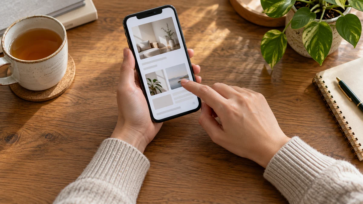
Many people who discover your business today will do so on a smartphone. Whether searching for a neighbourhood dental clinic, looking up a chartered accountant, or reviewing an interior designer, mobile screens are an important doorway for clients. While creating and evaluating a website on an office laptop or wide monitor feels comfortable, that spacious screen often hides friction points that appear only in the palm of your hand. Taking time to test your website on an actual phone before launch protects your brand reputation and prevents missed enquiries.
Check First-Glance Clarity and Layout Flow
When prospective clients arrive on your website, they should immediately recognise who you are, what service you deliver, and the area you serve. Mobile displays offer limited initial space, making it vital that your primary message stands out without requiring immediate scrolling.
Open your website on a handset and observe what appears before your thumb touches the screen:
- Compact headers: Ensure your logo and menu bar do not consume half the display. An oversized header pushes your core message out of view.
- Clear primary message: State your service offering immediately so visitors confirm they have reached the right place within moments.
- No horizontal scrolling: Your layout should fit comfortably within vertical screen boundaries. If the page wobbles or shifts from side to side, images or design blocks are improperly sized.
Evaluate Typography and Text Readability
Reading on a handheld display is very different from reviewing a printed document or working on a laptop. Small business websites frequently suffer from tiny fonts, cramped lines, and pale colours that become difficult to read under ambient glare.
Many clients browse websites outdoors in direct sunlight or while travelling. To ensure effortless reading:
- Comfortable font sizing: Body text should be easily readable without forcing visitors to pinch and zoom.
- Generous line spacing: Text lines packed closely together cause eye fatigue. Add sufficient breathing space between lines to guide the eye smoothly.
- Short paragraphs: Long paragraphs that look manageable on desktop monitors turn into dense walls of text on vertical phone screens. Keep thoughts to two or three sentences.
- Strong colour contrast: Avoid faint grey text against white backgrounds. Choose deep charcoal or dark tones that remain distinct even at reduced screen brightness.
Verify Navigation and Thumb-Friendly Tap Targets
Desktop visitors browse with a precise mouse cursor, but mobile visitors browse with their thumbs. Navigation on a phone must be forgiving, intuitive, and designed around how people hold their devices.
Designing for the Natural Reach
Most people hold their phone with one hand and navigate using their thumb. The easiest tapping area sits in the lower and middle zones of the screen. If essential buttons sit too high, reaching them requires awkward hand adjustments.
Examine your menus and buttons with these checks:
- Does the navigation menu open promptly when tapped and close without hesitation?
- Are menu links separated by enough space to prevent accidental taps on neighbouring pages?
- Are clickable buttons large enough to accommodate an adult thumb comfortably?
- Do fixed banners or floating elements block access to underlying content while scrolling?
Test Direct Contact Actions and Enquiry Forms
For independent professionals and service providers, a website exists to start client conversations. If an interested visitor struggles to get in touch, all previous design effort is wasted.
Test your contact pathways directly on a phone:
- Direct telephone links: Tapping your call button should open the native phone dialler immediately with your number ready. Visitors should never have to memorize or write down digits.
- Messaging chat links: If your website includes a direct chat option, tap it to ensure it opens the messaging application smoothly with a clear greeting.
- Short enquiry forms: Keep mobile forms brief. Asking for excessive details on a small touch keyboard discourages prospective clients. Ask only for essential contact information and a brief message.
- Correct keyboard displays: Tapping a telephone field should bring up a numeric keypad, while email fields should display an email keyboard layout.
- Clear confirmation messages: After form submission, display an unmistakable message confirming the enquiry was sent.
Observe Loading Speed on Cellular Networks
Testing your website solely on high-speed office broadband provides a false sense of security. Across Indian cities and towns, mobile connections regularly fluctuate between strong signals and patchy coverage.
Disconnect Wi-Fi and load your site using standard mobile cellular data:
- Prompt screen appearance: Does the basic layout appear within moments, or are visitors left staring at a blank screen?
- Smooth scrolling: Can you scroll immediately, or does the screen freeze while unseen scripts finish loading?
- Balanced image weights: High-resolution photographs taken directly from cameras are far too heavy for phones. Images must be properly compressed so they appear without delay.
- Snappy internal navigation: Move between service pages, project galleries, and contact pages to verify smooth transitions.
Inspect Media Displays, Pop-Ups, and Layout Stability
A polished mobile website feels stable and respectful. Sudden shifts and intrusive elements often drive visitors away before they review your services.
Review visual stability by watching for these issues:
- Prevent layout jumping: Ensure page elements do not jerk downward while images, notices, or fonts load in the background.
- Easily closed overlays: If you use an announcement banner or notice, ensure the close icon is prominent and easy to tap without being cut off by screen edges.
- Smooth map handling: If you embed a local map showing your office or clinic, ensure visitors can swipe past without getting stuck inside the interactive map view.
Key takeaways
- Test your website on physical smartphones rather than relying only on computer browser previews.
- Keep your header compact so your core services and location are immediately visible.
- Use comfortable font sizes and strong contrast for effortless reading under bright light.
- Provide ample spacing around buttons and menu links for easy thumb navigation.
- Ensure telephone links open the dialler directly and mobile forms remain short and simple.
- Check page loading over regular mobile data to reflect real-world visitor conditions.
- Eliminate unexpected layout jumps and verify that all promotional banners close smoothly.